6 beautiful examples of exceptional property marketing and advertising collateral
Property buyers are no longer after just the bricks and mortar when it comes to purchasing a home or investment. Buyers hone in on so many other elements surrounding the property itself, including the lifestyle, location, culture and reputation of the area.
This means that property developers can no longer rely on a handful of 3D images on an A4 brochure and expect it to sway a potential buyer.
Buyers make their judgements based on what they can get their hands and eyes on; from the experience of what is being offered. If the brochure and other advertising collateral looks cheap, the development is questioned. If the development does not have a website, it will not get the right traction. How judgmental we all are, these days.
Below I present six shining examples of exceptional, high-end property advertising collateral. Have a look at these examples; are they not beautiful? Do they not exude glamour, prestige and exclusivity? The collection of marketing and advertising pieces show how a property’s ‘story’ is revealed through the execution of marketing items, particularly through print.
I have deliberately focused on the luxury market because nothing says luxury like beautifully executed print finishes.
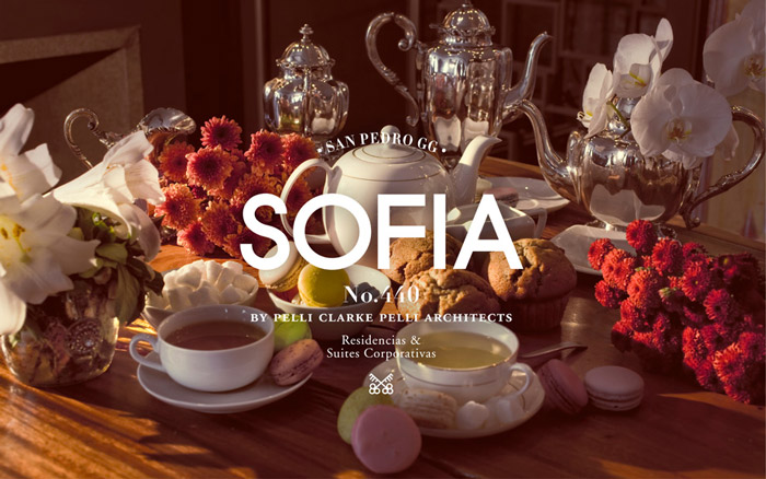
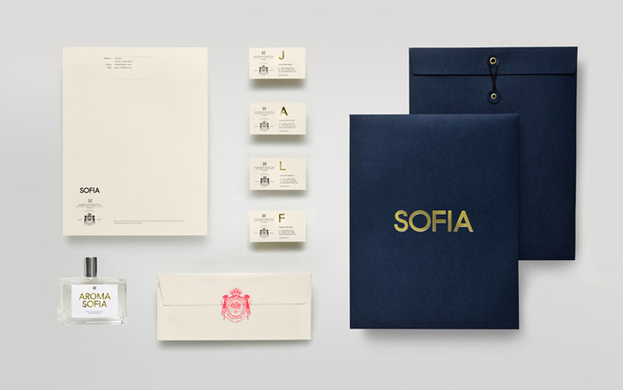
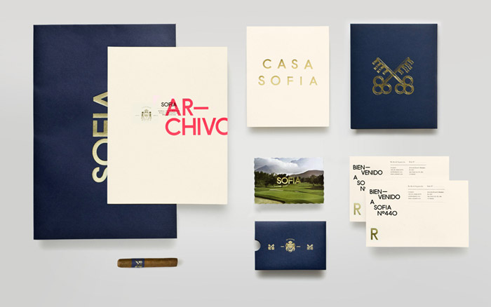
Sofia by Anagrama
This campaign for a property development in San Pedro, Mexico is out of this world. The project goes above and beyond the usual deliverables: umbrellas, authentic-probably-smells-like-awesome room fragrance with matching sample sticks and cigar labels, perfectly bound hardcover books with foiled edges encased in custom made gold foil boxes, and stunning photography that reminds me of Louis Vuitton celebrity campaigns. Not to mention the incredibly considered and sophisticated layouts, and unique use of type and embellishments.
This is one identity for a building that makes me want to cry a little – the creativity poured into this, to create something as daring and wide-ranging as this, is amazing.
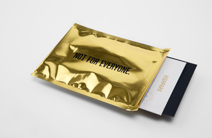
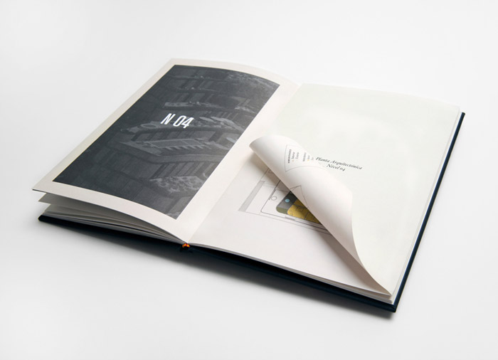
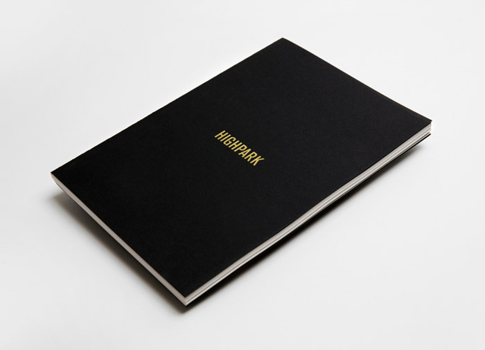
Highpark by Face
Another development in Mexico, located in San Pedro Garza García, a city described as “one of Latin America’s most affluent municipalities”.
When you think of affluence, you think of gold. The brief was to create advertising collateral that conveyed the luxury created by Mexican rockstar-architect Michel Rojkind and the exclusive lifestyle on offer in Mexico’s most coveted suburb.
The identity is sharp, clean and again, quite high fashion: font-based sans serif brandmark and sophisticated and subtle use of gold foiling (except for the envelope – that’s one very gold, very shiny packaging). I love the choice of uncoated material and textures, and the gold piping and binding of the brochures, which gives it a very elegant look-book finish.
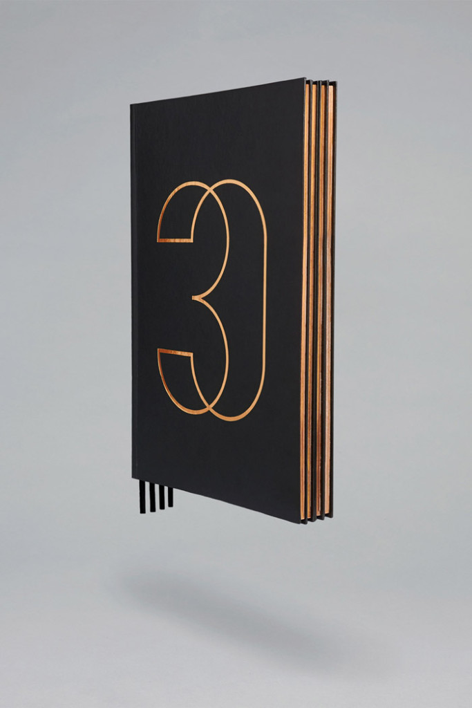
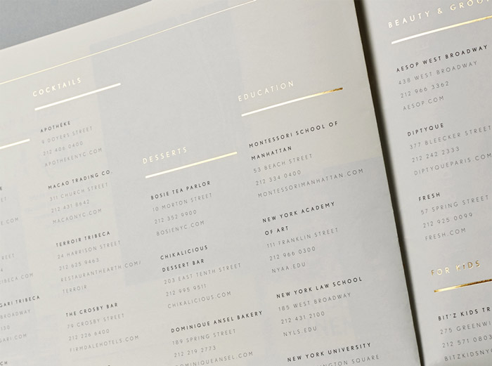
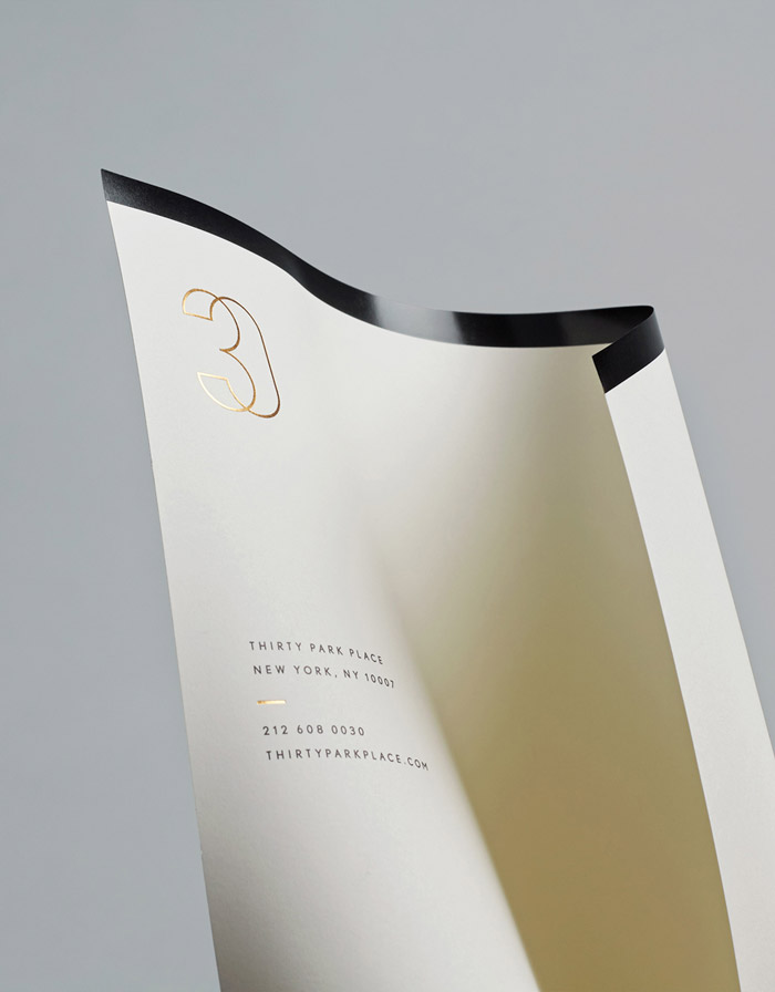
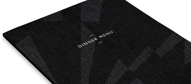
30 Park Place by Mother Design
I need to stop with the foil, I know. But it is a popular print embellishment when it comes to luxury property print collateral and it is easy to see why. When used properly (i.e. tastefully), it introduces a suggestion of opulence without the need to do anything more.
30 Park Place offers 157 luxury residences atop the renowned Four Seasons Hotel in Tribeca, New York. That short description is enough to imagine the creative brief for the development: create marketing collateral that presents a new paradigm in luxurious New York living.
Mother Design focused on a restrained colour palette; solid black, creamy ivory and matt gold foil. There is a mix of serif heading fonts and clean sans serif as the secondary font, an abstract brand mark and incredible, refined print finishes. Very upper-east-side/ cashmere wraps/ my-dog-has-its-own-personal-Pilates-trainer-esque. I am in love with the sharp and incredibly sophisticated letterheads.
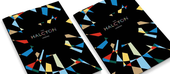
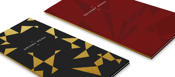
The Halcyon by SomeOne
Colour! Hurrah! The Halcyon is a retail development located in London’s Islington. The 18,000 square foot Victorian property includes a restaurant, food hall, gallery and a café. It was once a Post Office and in 1911 it was converted into a cinema.
There is something a little scary about having such a huge colour palette as part of an identity, but SomeOne embraced this wholeheartedly, using a geometric pattern made popular by British artists known as the Vorticists in the early 20th century.
The identity is an effective blend of crazy energy and classical aesthetics; it beautifully respects the history and age of the building, and celebrates the contemporary vision of the re-development.
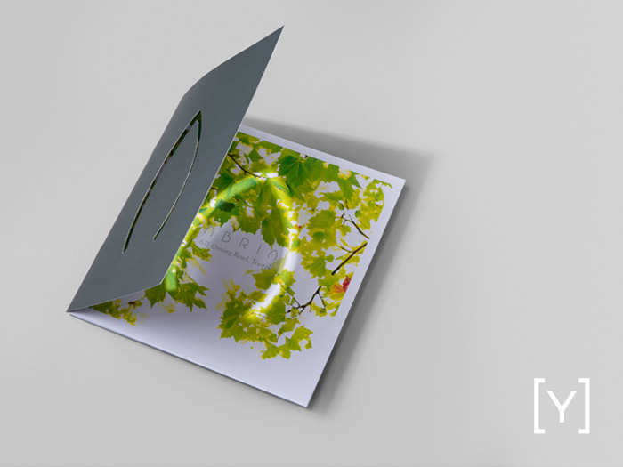
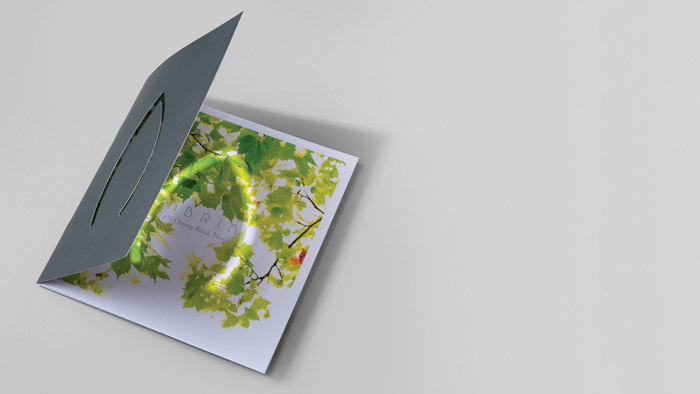
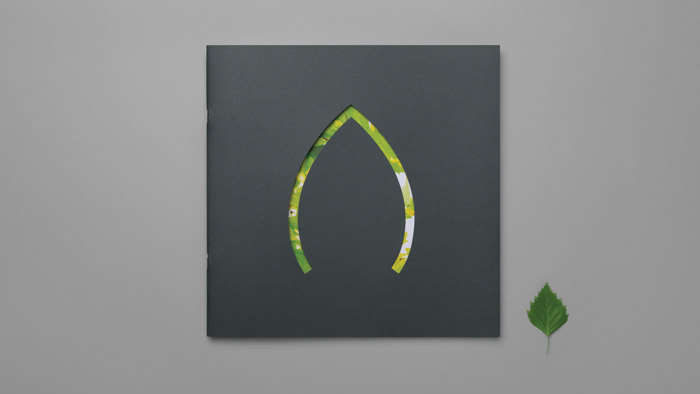
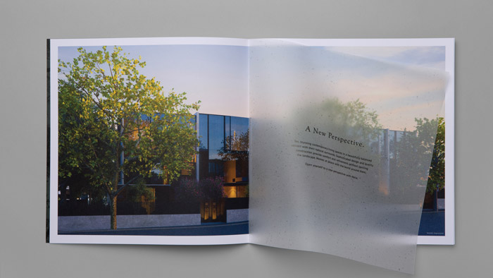
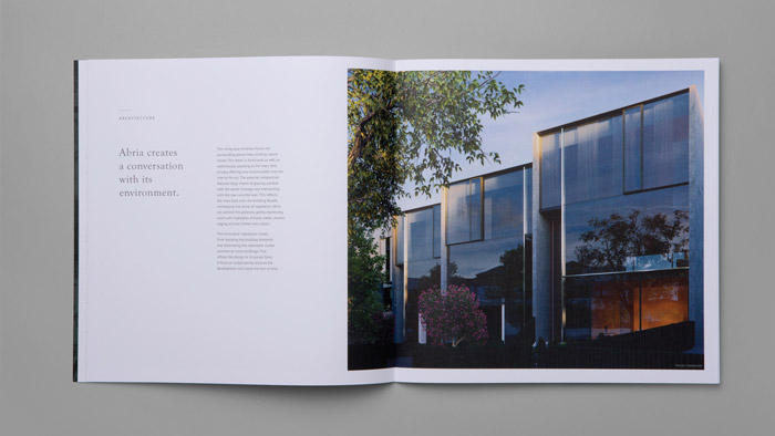
Abria by SGY
Consistency, with property marketing collateral, is tricky business. When SGY receives a new brief with the objective of ‘luxury’, it presents huge, exciting possibilities for both creative and actual execution of the advertising collateral.
I am a big believer that with good design and clever execution, it is possible to produce property marketing items that are sophisticated, sharp and sumptuous without breaking the budget. There are elegant solutions everywhere, particularly with print, and this is where solid supplier relationships come into play. And paradoxically, in the world of grandeur, sometimes less is more.
SGY recently launched abria.com.au, a website for a luxury development in Toorak. We created a strong concept stemming from the name and the architectural vision of the property; a development that creates a conversation with the environment.
The communications included press advertising, lifestyle photography, individually printed floorplans and a 26pp custom-size brochure with die-cut covers, translucent inserts and stipples of metallic ink. We let the beautiful renders speak for themselves and adopted the architect’s approach to the development – using raw, natural elements resulting in luxury with zero clutter.
Design is ever-evolving, and so are the trends in property marketing. It is interesting to note that 60% of luxury business will come from Asia in the next 10 years. Does this mean we will be seeing a change in design to vivid reds and a growth of developments with the number eight in them? Maybe.
Just like high-fashion, marketing luxury is about offering an enviable, aspirational lifestyle; it is about offering the ultimate modern fantasy. It revolves around the idea that the individual exists in relation to the brands that they own, the things that they have bought and that property and housing is about individual success, money and achievement.
Central to the design thinking in most of these examples was to create a feeling of opportunity. Receiving one of these brochures would feel like you have made it. And when a buyer feels that, it means your work here is done.