Eight beautiful wine packaging designs
From beautiful screen printed illustrations to intelligent corrugated cardboard cartons. Eight unique designs for wine packaging from across the globe.
1. Treasure by Supperstudio
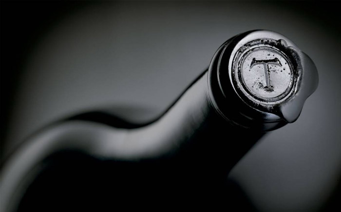
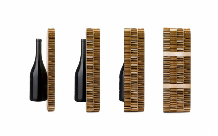
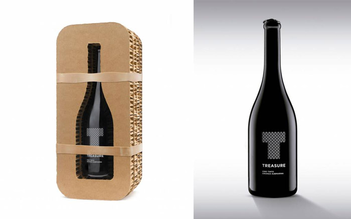
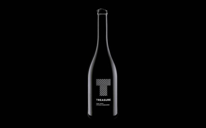
A truly unique wine brand, Crusoe Treasure source their grapes from selected small batch vineyards. The wine is first aged in barrels, before being bottled and stored under water to finish the ageing process in specialised submarine facilities located on the seabed. Supperstudio had the enviable task of developing the branding and packaging to tell this incredible story. Their solution was a beautiful icon of the ‘T’ made up of stacked circles to represent the bottles as they sit on the seabed. These, along with supporting type, are screen printed onto the bottle, which features a minimal black wax seal and innovative stacked corrugated cardboard wrapped in rubber bands to protect and cradle the bottle. The use of natural, organic materials is a fitting representation of the story of this exclusive wine and its position as ‘a real treasure which must be protected.’
2. AO. by Aditya Wijanarko
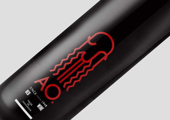
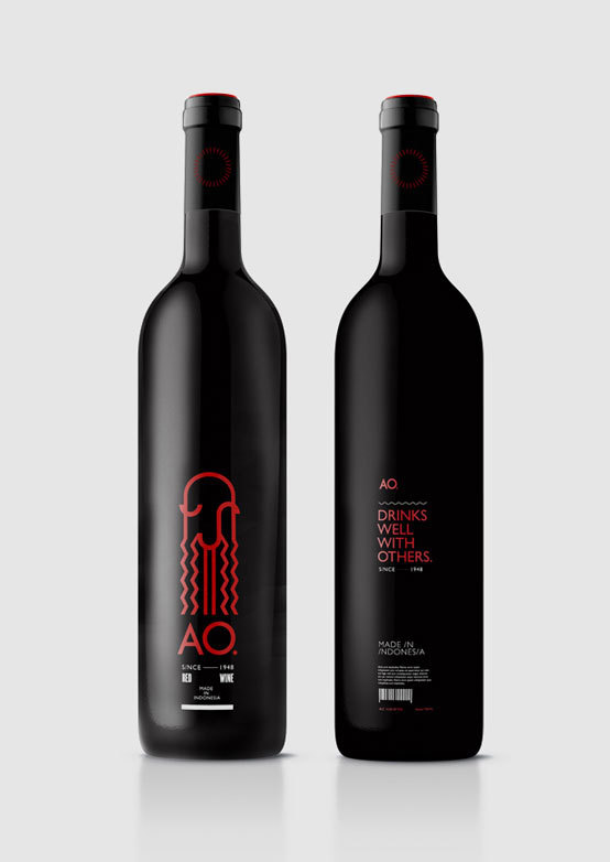
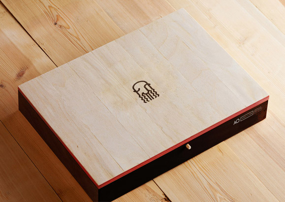
I’m a real sucker for minimal illustration paired with cool packaging, and this brand by Jakarta based Aditya Wijanarko has both in abundance. AO. is a rebrand of the Indonesian line of wines Anggur Cap Orang Tua, and is designed to attract a younger audience who still enjoy good quality wine. I’m not the biggest fan of Indonesian wine, but this uber cool beardyman illustration paired with minimal type, then packaged in a beautiful plywood box has me sold.
3. 8 Wine by Eight Studio
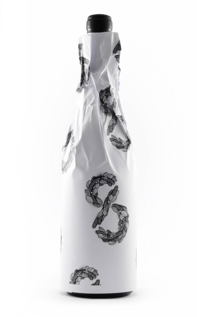
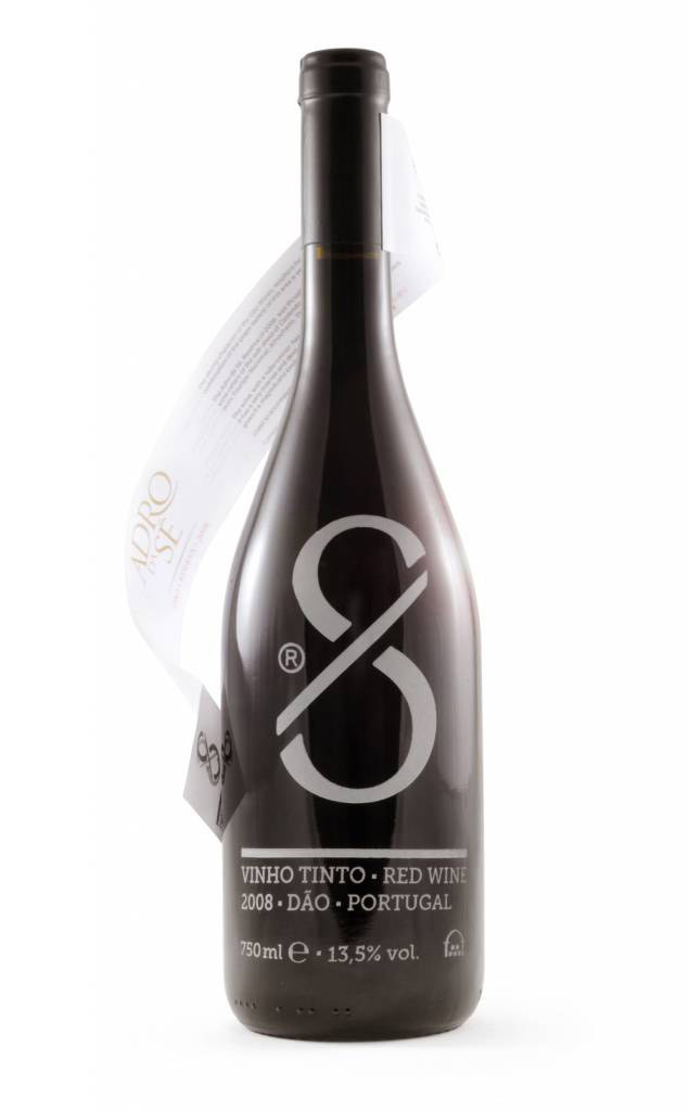
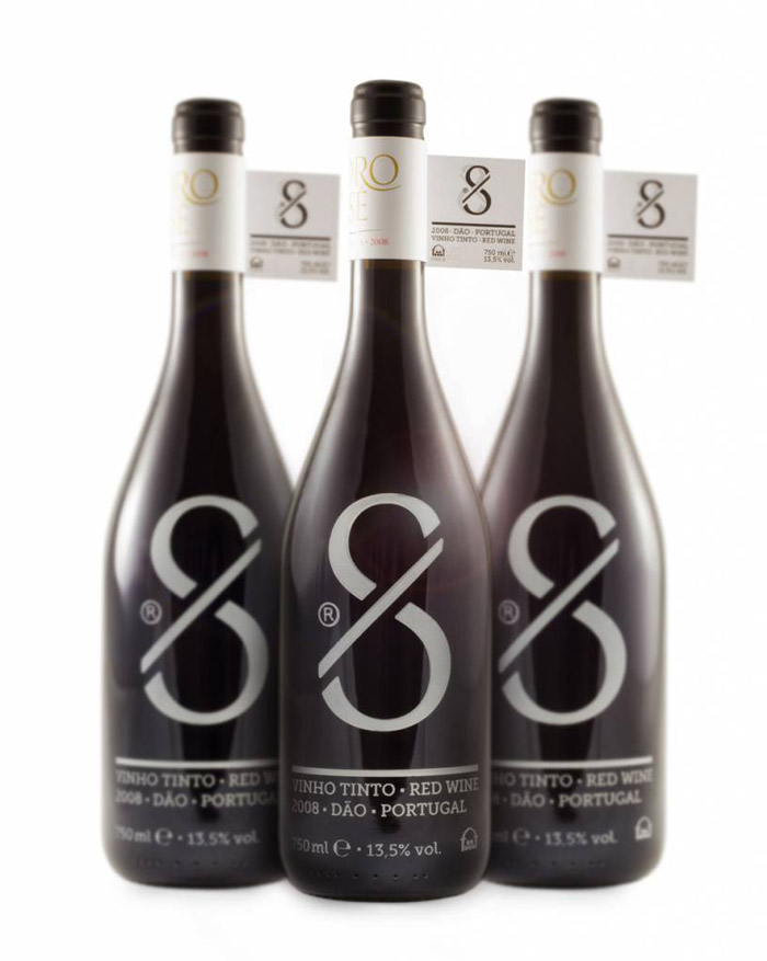
Eight Studio have developed a really beautiful Christmas gift and a wonderful example of creative wine packaging in a partnership with Portuguese winemakers UDACA. A beautifully detailed illustration of the number ‘8’ is tiled on a paper wrap which is removed to reveal the core brand on neck tags and screen printed graphics underneath.
4. #wytrawnarobta by Hopa Studio
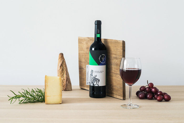
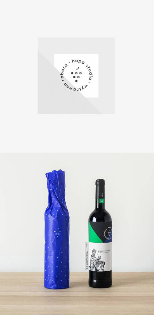
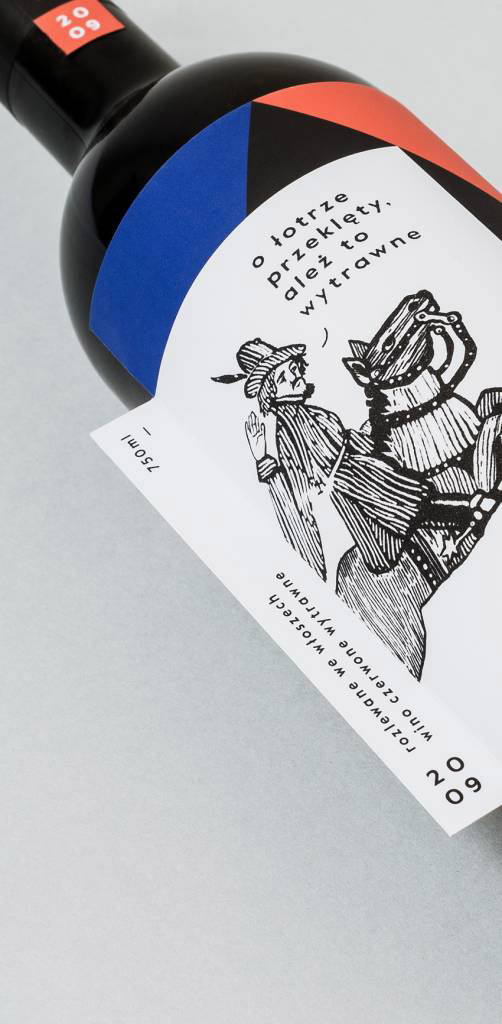
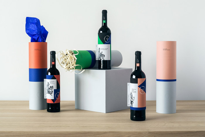
My love of minimalism is completely indulged in this amazing project by Warsaw based Hopa Studio, which has been created with a series of limited edition wine bottles. The colour palette is the real winner in this project, from the blue and red screen printed wrapping paper to the the dry-printed symbol on the tubes and labels being layered over colourful shapes and lines. Hopa also created a series of screen-printed posters which advertise each bottle.
5. Hidden Sea by Co-Partnership
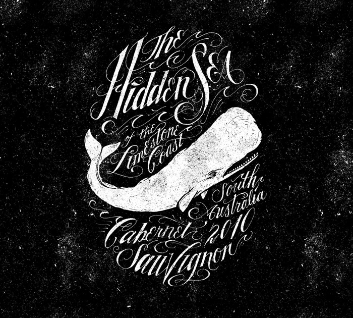
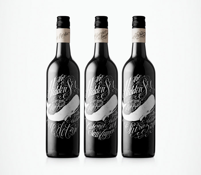
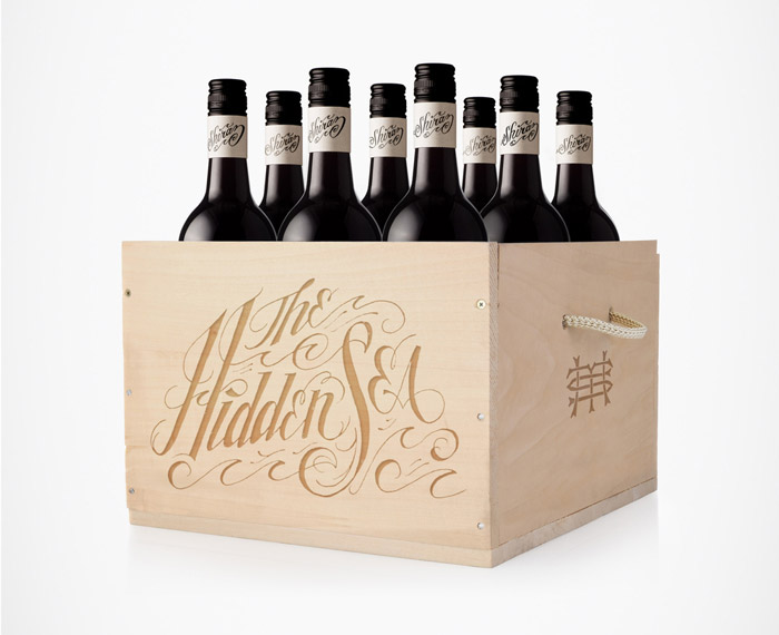
I’ve always been fascinated by stories about legendary sea creatures like the kraken or Moby Dick, so when I stumbled across this amazing bottle by Surry Hills, Sydney, based studio Co-Partnership, I couldn’t resist taking a closer look. Incredible illustration and intricate typography are the key to this beautifully presented wine.
6. Porter & Plot by DIA New York
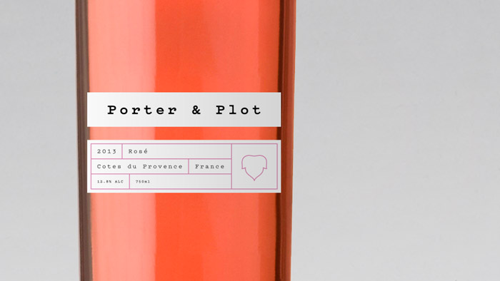
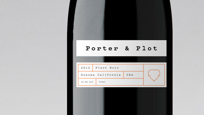
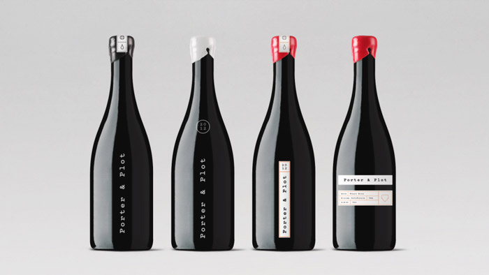
Inspired by old port bottles and packing labels, New York design studio DIA have designed a crisp piece of minimalism using the beautiful Pitch typeface designed by Kris Sowersby and supported by simple icons about the winemaking process.
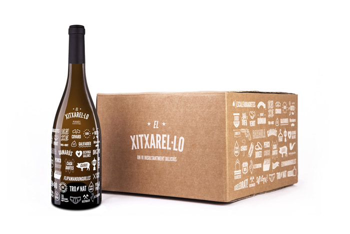
7. El Xitxarel•lo by Albert Virgili Hill
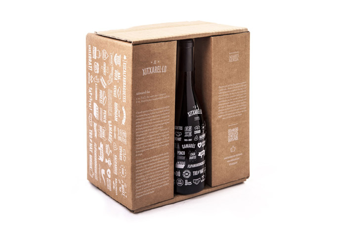
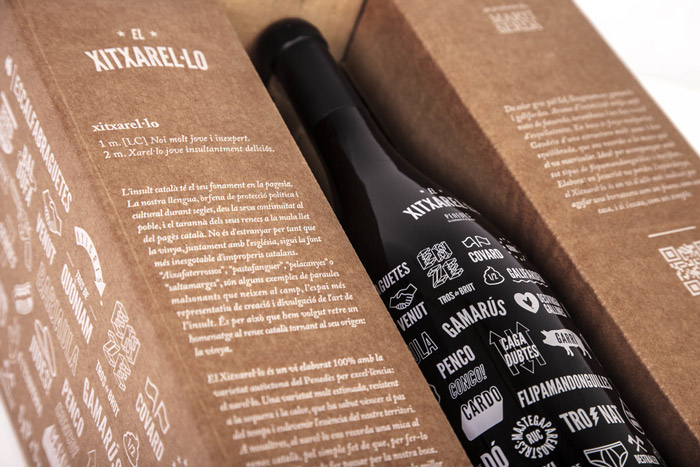
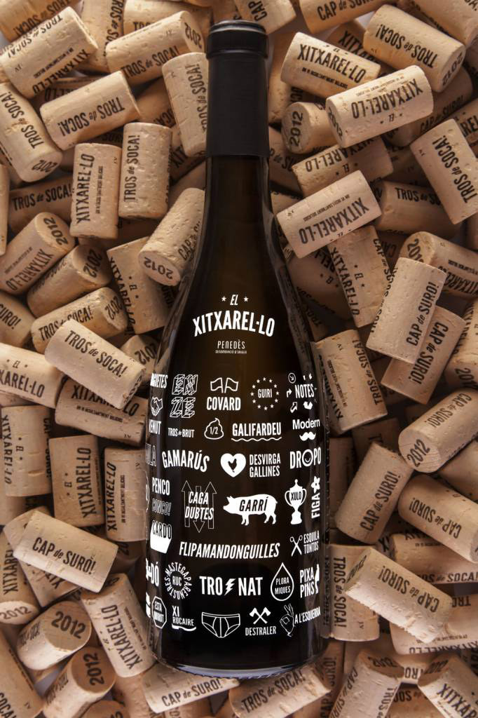
Definitely the funniest piece of packaging of the bunch, El Xitxerel was designed by Albert Virgili Hill and is graphically illustrated with 77 Catalan insults. According to Hill, the Catalan language has its foundation in peasantry. “Our language, political and cultural orphan protection for centuries, the town owes its continuity, and the nature of their oaths to the nastiness of the Catalan peasant. It is not surprising therefore that the vineyard, along with the church, is the source of endless Catalan insults.” I especially love the use of just white inks in this brand. It really lets the type, graphics and cool, six pack packaging do all the talking.
8. ESTE by The Collective
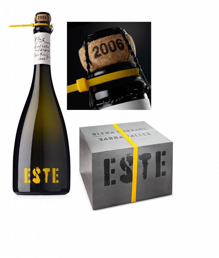
Briefed to create a brand that looked as though it had been made in a corrugated iron shed, The Collective have created a wine with attitude. For me, this wine is all about the little details, from the bright yellow zip tie, to the spray-paint style stencil. However, even with the rugged theme, the use of the wide bottomed bottle and a champagne cork seal, ensure this wine retains a premium look.
