Prawns, lobsters and pineapples – An appreciation of Australian currency
Whilst living abroad for over 10 years, I was always overcome with a sense of nostalgia when discovering a crumpled up Australian $10 note that was hiding in an old bag of mine, or when (once in a blue moon) I decided to clean out my purse and found a small fiver tucked away in a forgotten side pocket concealed under a group of old receipts.
The colourful and vibrant Australian currency has always made nationals proud to show off its beautifully designed notes to anyone who was willing to listen or had the fortunate circumstance to own their very own samples.
Since my return to Melbourne, I have found my friends (majority being British, which makes it even funnier) proudly using nicknames such as a ‘prawn’ or ‘flamingo’ if you happen to flash them a fiver, or ‘heelers’ for those who need to break a ten.
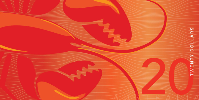
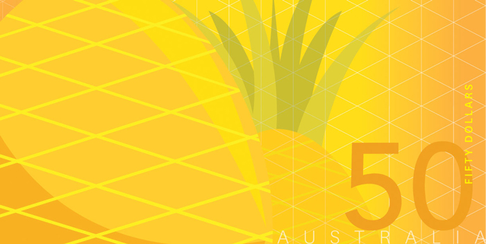
Everyone knows ‘lobster’ is the beloved term for twenties, however, my personal favourite is the ‘pineapple’ for the fifty-dollar note which, interestingly enough, everyone always apologises for using whenever they have one. As for the $100 note, these are so rare to me that I had to look up what reference is being used and found ‘granny smiths’ being listed. Nice.
Update: January 2025
If you’re reading this, chances are you Googled ‘Australian money slang’ or similar and found us at the top of the results page. Hi! We’re SGY, a digital agency specialising in financial services, and we’re pretty good at getting Google traffic for brands (this page has had more than 5,000 visits from Google in the past 12 months). Check out some of our work here or say hello here.
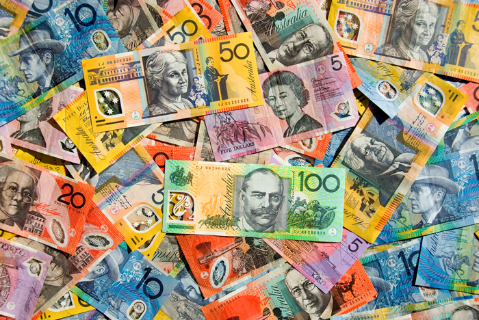
All these endearing names are of course because of the vibrant colour palette we use on our currency, not because we happen to have prawns staring up at us from a five-dollar note, although to be honest, maybe it’s something I should write into the Reserve Bank of Australia (RBA) as a consideration.
This defined colour palette of violet/pink, blue, red, yellow and green gives our currency a fresh, vibrant and youthful feel, which stands apart from other global currencies. A lot of people probably don’t even notice currency colour or design, but I find it interesting learning what countries use and why they use it.
For example, did you know the euro banknotes feature architectural styles from different periods in Europe’s history, such as Classical, Romanesque, Gothic and Renaissance just to name a few. I can just imagine how difficult it must have been to settle on a design style for one currency that represents so many uniquely historic European countries.
The euro banknotes are also quite colourful like the Australian currency, but not nearly as vibrant as our notes. I must admit I have had many people abroad tell me they feel like they are playing with Monopoly money when they have Australian currency in their grasp.

Another brilliant detail that makes our notes stand apart from the rest of the world is the fact that the tenner you shoved into your back pocket the night before could take a spin in the washing machine and still be used weeks after when you finally fish it out of your clean pair of jeans.
This is, of course, because of the plastic material of the note called polypropylene polymer, which, in fact, is a feature Australia was the first country in the world to use. They last four times as long as conventional paper and also provide greater security against counterfeiting. But enough about the stock, let’s get back to the designs.
Apparently the RBA have for years been in the process of re-designing the bank notes (thankfully I hear the colours will not change – Viva la Pineapple!) and replacing them with a whole new range that will include new security features, yet have a more ‘youthful’ design.
According to News.com.au: “Designers have been briefed to capture Australian characteristics with youthful and energetic design qualities. The initiative followed research by the bank that found most Australians couldn’t name the faces on their national currency.” [1].
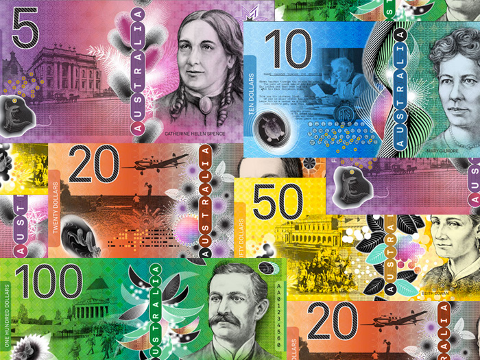
The whole re-design process will take years to master, with the RBA engaging top renowned ‘banknote designers’, who will submit their designs and then after much evaluation be chosen as the preferred designer. One of these designers is Melbourne-based Garry Emery, who worked on the existing note designs.
Now think about that for a minute, if your design is chosen, it will circulate the nation – scrap that – circulate the globe. If that isn’t a great call for self-promoting then I don’t know what is.
Imagine hanging out in a group of people having them ask you if they have seen any of your work after you tell them you are a designer. You can then proudly say that they look at your work every day, fondle your work every day, and that people cannot get enough of your work.
The amount of detail that goes into a design is astounding. I can just imagine the research and processes that need to be in place first before even attempting a new design.
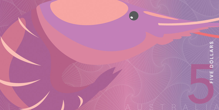
I am interested to see the final product from the RBA – perhaps in the mean time I might send them my proposed designs, which I feature below. Proudly designed in ten minutes and keeping in line with their preferred names and colours, perhaps coming soon to a bank near you?
[1] News.com.au 2014. Bank note designs cash-in on ‘youthful’ image.